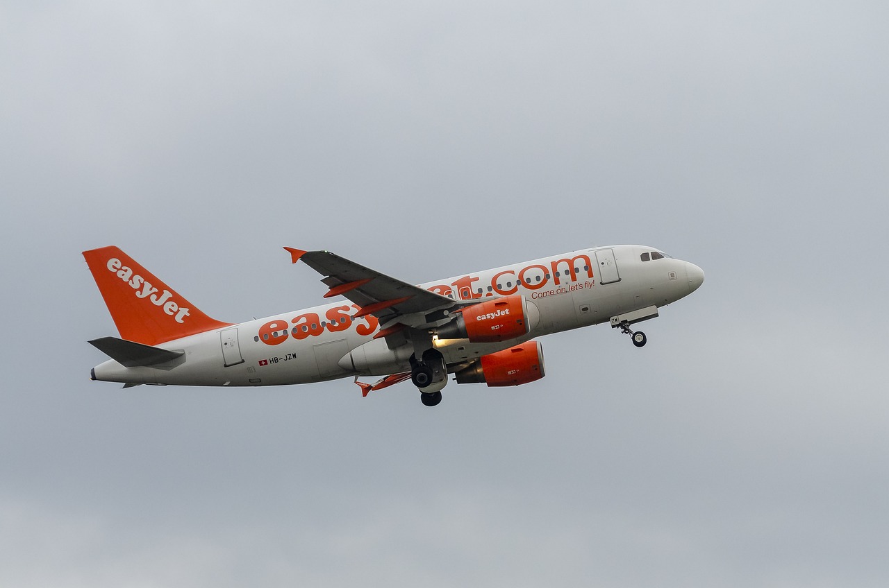
easyJet built a recognizable brand around its bold orange color, creating a distinct identity in aviation. The UK-based low-cost carrier’s iconic livery is more than just a color choice; it represents a dynamic and energetic ethos that sets the airline apart. easyJet ensures visibility at airports across Europe with its vibrant orange hue. As a result, this choice plays a central role in its marketing efforts. The airline uses Pantone 021C, a specific shade of orange, to achieve branding success.
easyJet embraced this striking color from the start. Over time, as the airline evolved, its paint schemes also changed. However, the one constant remained orange in various design elements, from the fuselage to the engine cowlings. This bold decision helped easyJet maintain a unified and recognizable presence. Consequently, the airline stood out in an industry with many subdued colors. Indeed, the simple yet powerful color choice helped easyJet rise as a major player in the European market.
Despite facing challenges over branding, such as legal disputes about color ownership, the distinctiveness of orange worked in easyJet’s favor. In fact, the vibrant color became synonymous with the airline’s identity. Furthermore, it extended beyond planes to uniforms and even the headquarters. Although easyJet encountered occasional legal battles, its commitment to a bold branding strategy solidified its place as a household name in low-cost European air travel.
Today, easyJet’s use of Pantone 021C remains a symbol of the airline’s mission to make travel affordable and accessible. In addition, its “Orange Spirit” ethos goes beyond the color. It reflects the airline’s commitment to innovation, diversity, and sustainability. Ultimately, easyJet’s bright orange creates a strong visual identity and encapsulates the airline’s values, making it essential to its success.
Related stories:
Catch up on the top stories and travel deals by subscribing to our newsletter!

